


In an era where digital presence is imperative, having a responsive website is no longer optional—it’s essential. At Constructive Visual,...


If you’re looking to increase your website’s conversion rate, then it’s important to focus on your web design. After all, a well-designed website is more likely to convert browsers into buyers than one that looks cluttered and unprofessional. In this blog post, we will discuss 10 principles of good web design that will help increase your conversions!

How users think when on your website is important to take into consideration when creating a website. People want to be able to find what they are looking for quickly and easily. Web design should be simple, without too much clutter. The use of colour should be carefully considered, as it can affect a user’s mood and how they perceive the website.
Attention should be paid to typography, as it can create a sense of professionalism or amateurishness. Website navigation should be easy to understand and use, with clear labels and consistent structure. Images should be used sparingly, as they can often distract from the content. Finally, the overall layout of the website should be pleasing to the eye and easy to scan. By following these principles, you can create a website that is both user-friendly and visually appealing.
The first thing you need to know about web users is that they don’t read instead they scan. So your task as a web designer is to make sure that your website can be easily scanned. You can do this by using headlines, sub-headlines, and bulleted lists. Breaking up your text into small chunks makes it easier for users to scan and find the information they’re looking for.
It’s no surprise that attention spans are getting shorter and shorter. With the vast amount of information available online, users have become used to being able to find what they’re looking for quickly and easily. This means that you have a very limited time to capture a web visitor’s attention.
This links to the previous point! When a user comes to your website, you want them to know immediately what your company is selling and what your main product is. This can be done by using strong visuals and clear, concise text.
Your hero products should be featured prominently on your website, and they should be easy to find and identify.
One way to make your hero products stand out is to use relevant images. Images are often the first thing that a user will notice when they come to your site, so it’s important to make sure that they are relevant to your business. If you sell products that are visually appealing, then you should use images that highlight this aspect of your product. For example, if you sell jewellery, you might want to use images of people wearing your jewellery or close-ups of the jewellery itself.
Another way to make sure that your hero products are easy to find and identify is to use clear, concise text. You want to make the text large to visually set it apart from the rest of your site content, and you want to use clear language that describes what your product is. For example, if you sell jewellery, you might want to use the text “Find the perfect piece of jewellery for any occasion” or “Shop our collection of unique jewellery.“
Finally, you want to make sure that your hero products are easy to purchase. You can do this by including relevant call-to-action buttons or links near your hero products. For example, you might want to include a “Buy Now” button next to your product images or a link to your product pages. By making it easy for users to purchase your products, you can increase your chances of making a sale.
Sometimes less is more. When it comes to web design, simplicity should be your goal. A simple website is easier for users to navigate and is less likely to overwhelm them with too much information. It is also more visually appealing and can create a sense of professionalism.
Many web designers make the mistake of thinking that a website needs to be filled with bells and whistles to be effective. However, this is often not the case. A website that is too busy or cluttered can deter users from staying on the site. It can also make it more difficult for them to find the information they’re looking for.
The fewer options the customer has the more likely they are to find their way to the checkout or call-to-action (CTA) button!
When a user comes to your website, they will form an opinion of your company within seconds. This is why it’s important to make sure that your website makes a good first impression. A well-designed website will instil confidence in users and give them the impression that you are a professional, reliable company.
Having a professionally created website ensures that your first impression with your visitors is a memorable one. It’s important to have a website that is easy to navigate and visually appealing. A website that is poorly designed will reflect poorly on your company and turn potential customers away.
Investing in a quality website is one of the best ways to ensure that your business makes a good first impression. A professionally designed website will make you look more credible and trustworthy, and it will help you attract more customers. If you’re looking to improve your online presence, contact Constructive Visual for a website design quote today.
The “fold” is the term used to describe the area of a website that is visible without scrolling. This is where you need to put your most important information, as users are likely to leave if they have to scroll down to find what they’re looking for.
While the “fold” is important, don’t forget about the rest of your website! This is where you can provide more detailed information about your product or service. You can also use this space to inspire and educate users with blog posts, infographics, and other types of content. This not only helps to keep users on your site longer, but it can also help to increase conversions.
Your CTA (call-to-action) buttons are one of the most important elements of your website. These are the buttons that tell users what you want them to do, such as “buy now” or “sign up for our newsletter“. It’s important to make sure that these buttons are working properly and that they are prominently displayed.
You can do a quick audit and test all of the buttons on your website yourself. Simply click on each button to make sure it goes to the correct website. If you have a lot of buttons, you may want to use a website testing tool like BrowserStack to test them all at once.
If you find that any of your call-to-action (CTA) buttons are not working, make sure to fix them as soon as possible. Users will likely not take the time to try and figure out why the button isn’t working, they’ll just move on to another website. Prominently displayed and functioning CTAs are essential for driving conversions on your website.
Users often scan web pages in an “F” or “Z” pattern. This means that they will look at the top of the page first, then move down the left side, and finally scan the right side. This is why it’s important to put your most important information on the top left side of your website.
The study shows that users often don’t scroll down, so you need to make sure that your most important information is above the fold.
In addition, the study found that users often click on links that are higher up on the page. This means that you should put your important links near the top of the page as well.
Finally, users often click on links that are to the right of the page. So, if you want people to click on your links, make sure they are placed on the right side of the page.
Following these tips will help ensure that your website is easy to use and navigate for all users.
Whitespace, also known as negative space, is the space on a web page. It can be used to break up text and create visual interest. When used correctly, whitespace can help to increase conversions by making your website more readable and easier to navigate.
While some web designers believe that every last pixel on a page should be used, this is not always the best approach. In fact, using too much whitespace can actually make your website appear cluttered and unprofessional. The key is to strike a balance by using whitespace judiciously.
Here are some tips for using whitespace on your website:
When used correctly, whitespace can make your website feel clean and inviting. So don’t be afraid to use it! Just make sure you use it sparingly and intentionally.

Dwell time (the amount of time a user spends on your website) is a critical metric to track. The longer a user stays on your site, the more likely they are to convert. There are several ways to increase dwell time, such as by creating compelling content or by making it easy for users to find what they’re looking for.
The more relevant and compelling your website content is for your audience, the more likely they are to stay on your site and engage with it. In addition to well-written and informative content, website design also plays a role in dwell time. If your website is difficult to navigate or doesn’t have a clear call-to-action, users are likely to leave before spending much time on your site.
To keep people engaged with your website, it’s important to regularly update your content and design. By making small changes on a regular basis, you can keep people coming back for more, which will ultimately lead to increased dwell time and conversions.
A well-designed website is easy to navigate and provides the information that users are looking for clearly and concisely. One of the most important aspects of good web design is creating a structure for the site that ensures that users can find what they need quickly and easily. This often starts with a simple navigation bar that lists the different sections of the site. Within each section, the content should be organised logically, with headings and subheadings used to break up long blocks of text.
Good web design also involves using visual cues, such as icons and graphics, to help guide users through the site. By taking the time to plan a clear and effective structure for your website, you can make sure that users have a positive experience and can find the information they need.
A study by Google showed that 53% of mobile users will leave a page if it takes longer than three seconds to load. This means that it’s critical to have a fast-loading website, especially if you want to increase conversions. There are many ways to improve your site’s speed, such as by optimizing images and using caching.
Slow loading times can have a significant impact on your business. If potential customers are trying to visit your site and it’s taking too long to load, they’re likely to give up and go somewhere else. This not only results in lost traffic, but also missed opportunities for conversions.
There are a number of ways to improve your site’s speed. One is to optimize your images. This means compressing them so that they take up less space and load faster. Another is to use caching, which stores certain elements of your website so that they don’t have to be loaded each time a visitor accesses the site.
Google also uses page speed as a ranking factor in its search algorithm, so a fast-loading website could essentially help with your SEO efforts and possible listings with the search engines such as Google, Yahoo and Bing.
To get an idea of how fast your website is currently loading, you can use Google’s PageSpeed Insights tool. This will give you a score out of 100, with higher scores indicating a faster site. If you’re not happy with your score, there are a number of things you can do to improve it. Once you’ve made some changes and improved your page speed, be sure to run the test again to see if your efforts have paid off.
As more and more people are using their mobile phones to browse the internet, it’s important to make sure your website is responsive. A responsive website is one that is designed to work well on all devices, from desktop computers to mobile phones.
If your website isn’t responsive, you could be missing out on a lot of potential customers. Make sure your website is responsive and mobile-friendly to ensure that everyone can find and use your business.
A majority of people these days will take out their phone to research a project or service to compare prices or to find more information before making a purchasing decision.
If you have a responsive website, your potential customers will be able to find the information they need about your business quickly and easily. A responsive website is essential for any business that wants to stay ahead of the competition.
This is why the first thing that should be on your website is a clear and concise statement of what your business does. This can be done in the form of a tagline or by using an image with a text overlay. The copy must convey the message that you are the right business to solve their problem.
The very first page that your website visitors will land on is your homepage. That first piece of real estate is called the “Above the fold” before a visitor has to scroll below the fold to see the rest of your page. The above the fold area is the most important part of your website to first capture your visitors attention before they start scrolling.
It is important to make sure that your heading 1 tag accurately reflects what your business is about, as this is one of the first things that a visitor will see.
Your heading 1 tag should be placed above the fold so that visitors can easily identify what your business is about. This will help them to make a decision about whether they want to stay on your website or not. Having a heading 1 tag above the fold also helps search engines to understand what your website is about, which can improve your ranking in search results.

As mentioned before attention is short so below are just a few ways you can keep your user’s attention:
Websites are typically made up of a mix of static and dynamic content. Static content is information that doesn’t change, such as text, images, and videos. Dynamic content is information that is constantly changing, such as news articles, weather reports, and social media posts. Websites are usually designed using a mix of HTML, CSS, and JavaScript code.
HTML is used to structure the content on a page, CSS is used to style the content, and JavaScript is used to add interactivity to the page. Websites can be created by individuals or organisations, and they can be private or public.
When it comes to web design, one of the most important factors in choosing the right images. Images communicate a wide range of information to your audience, from conveying the aesthetic of your site to conveying key concepts or ideas. To make the most impact with your images, it is important to select those that are both compelling and relevant.
With regards to selecting compelling images, you should consider things like visual appeal and emotional impact. Consider incorporating interesting lighting or colour schemes, or taking advantage of dramatic compositions and unique perspectives. Be sure to avoid using images that are overused or clichéd, as these may not resonate with your audience in the same way as original and creative designs.
Along with considering how compelling an image is, you should also be mindful of how relevant it is for your website. This means selecting images that fit in naturally with the overall aesthetic and feel of your site, while also highlighting content or areas that you wish to showcase. When conducted thoughtfully and intentionally, carefully choosing images can take your web design to the next level by making a powerful first impression on visitors and engaging them in meaningful ways.
If you’re not A/B testing your web pages, you’re missing out on a huge opportunity to optimize your site for conversion. A/B testing, also known as split testing, is a method of comparing two versions of a webpage to see which one performs better. To do this, you simply create two versions of a page, each with a different element (eg. headline, call-to-action button, etc.), and then send traffic to both pages to see which one produces more conversions.
The beauty of A/B testing is that it allows you to test different hypotheses about what works best on your site, without making any permanent changes. And best of all, it’s relatively easy to set up and can be done with any website. So if you’re not already A/B testing your web pages, now is the time to start.

This is a very important section! Any good web design should take into account the importance of effective copywriting. After all, the words on a website are just as important as the visuals in conveying the overall message and tone of the site. Good copywriting can help to clarify the purpose of the site and keep visitors engaged. It can also be used to highlight key features and encourage conversions. In short, good copywriting is an essential part of any successful web design. When it comes to creating effective copy, it is important to focus on clarity and conciseness.
The use of simple language and short sentences can help to make complex concepts more understandable. At the same time, it is also important to use persuasive language that encourages the reader to take action. Ultimately, effective copywriting is all about finding the right balance between these two elements. By taking into account the power of effective copywriting, you can create a website that is both informative and engaging. Below is some step by steps ways to take your copywriting to the next level.
One of the best ways to make your copy more readable and engaging is to structure it in an easily digestible format. This means breaking up your text into smaller paragraphs, using subheadings to organise your thoughts, and incorporating bullet points or lists whenever possible.
By formatting your content in this way, you can help improve dwell time and conversion!
Bullet points are a great way to summarise key information and make it more digestible for readers. When used effectively, they can also help to highlight key points and encourage conversions.
So if you want to take your web design to the next level, consider incorporating bullet points into your copy. This will help to make your content more readable and engaging while also helping to improve conversion rates.
Here’s why bullet points in your copy are so powerful:
As we mentioned before, effective copy copywriting is all all about finding the right balance between clarity and persuasion. This should be reflected in your call-to-action (CTA) copy, which should be clear and concise while also encouraging the reader to take action.
Your CTA should be visible and easy to find, and it should be relevant to the page content. It should also be action-oriented, using persuasive language that encourages the reader to click through.
Some tips for effective call-to-action copy for your website:
Did you know that you can use punctuation marks to make your copy more readable and engaging? For example, adding bold or italics to certain words can help to draw attention to them.
You can also use exclamation marks and question marks to add emphasis. And using ellipses (…) can create a sense of suspense that encourages the reader to keep reading.
Fonts are an important part of any web design, and they can have a big impact on the overall tone and feel of your site. When choosing fonts, it is important to consider both readability and aesthetics.
For example, serif fonts are generally more readable but may not be as visually appealing. On the other hand, sans-serif fonts are often more visually appealing but can be less readable. Ultimately, it is important to choose a font that strikes the right balance for your particular project.
Another important factor to consider is the size of the font. Again, readability is important here. But you also want to make sure that the font is large enough to be easily visible on all devices.
Finally, it is also worth considering the colour of the font. While the black text on a white background is generally considered to be the most readable, you may want to experiment with other colour combinations to see what works best for your particular project.
To effectively market your product or service online, you need to use language that is designed to convert. This means using the right keywords and phrasing that appeal to your target audience and motivate them to take action. It also means writing in a clear, concise style that makes it easy for potential customers to understand what you have to offer and how they can benefit from it.
By incorporating proven techniques for effective conversion into your website copy, you can ensure that more people find your site, stay engaged with your content, and ultimately become paying customers. Whether you’re looking to attract new leads or boost sales, good online marketing starts with strong writing skills and a strategic approach. So start crafting effective web copy today, and see how using the right language can help transform your website into an effective marketing tool!

In today’s world, more and more people are using their mobile devices to access the internet. This trend is only expected to continue, which is why it’s so important to make sure your website is mobile-friendly. Mobile compatibility means that your website can be easily viewed and interacted with on a phone or tablet.
This is achieved by designing a responsive website that automatically adjusts to fit the dimensions of any screen. Mobile-friendly websites are essential for providing a good user experience and keeping visitors engaged. In addition, they’re also more likely to rank higher in search results, making them more visible to potential customers. With so many benefits, there’s no reason not to make sure your website is mobile-compatible.
This is achieved through responsive design, which is a technique that allows websites to automatically adjust their layout to fit the dimensions of any screen. This is essential for providing a good user experience and ensuring that visitors can easily interact with your site no matter what device they’re using.
With the rapid pace of technological advancement, it’s impossible to predict what new devices will be available in the future. But by using responsive design, you can ensure that your website will be compatible with any new products that come onto the market.
Mobile-first design is an approach that focuses on designing for mobile devices first and then adapting the design for larger screens. This is in contrast to traditional design methods, which start with desktop designs and then make adjustments for mobile.
The reason for this switch is that more people are now using their mobile devices to access the internet than ever before. Recent studies have shown that over 58.26% of internet traffic now comes from mobile devices.
The mobile-first design ensures that your website provides a good user experience on all devices, no matter how large or small the screen is. This is essential for keeping visitors engaged and ensuring that they continue to use your site in the future! The last thing you want is to spend countless hours designing a beautiful website that no one can use.
By following these principles, you can create a website that is not only visually appealing but also easy

A very underrated part of web design is the importance of colour. The colours you use on your website can have a big impact on how visitors perceive your brand.
For example, studies have shown that blue is associated with trustworthiness and calmness, while red is often seen as exciting and energetic. Therefore, if you want to create a website that instils confidence in visitors, you should use a blue colour scheme.
On the other hand, if you’re looking to create a site that is lively and exciting, you might want to consider using a red colour palette.
Of course, you don’t have to limit yourself to just two colours. A website can use any number of colours, as long as they work well together. However, it’s important to remember that too many colours can be overwhelming and difficult to look at. Therefore, it’s usually best to stick to a maximum of three or four main colours.
Another thing to keep in mind is the different meanings that colours can have in different cultures. For example, white is often associated with purity and cleanliness in Western cultures, but in Eastern cultures it is often seen as the colour of death. Therefore, if you’re targeting a global audience with your website, you should be mindful of the different connotations that colours can have.
It’s important that your images are kept relevant to your branding and to the message that you’re trying to get across with your website. The last thing you want is for people to be confused or turned off by images that don’t fit in well with the rest of your website.
Your website should be an extension of your brand and reflect your company’s values and mission. This means that every element on your site, from the colours you use to the images you select, should be in line with your brand identity.
Using consistent branding will help visitors easily recognise your website and remember it in the future. It’s also essential for building trust with visitors and ensuring that they continue to use your site.
There are a few key elements to consider when making sure your website is consistent with your branding:
There are many great sources of free, high-quality images that you can use on your website. These images can help to make your site more visually appealing and add interest to your content.
Unsplash, pixelbay, and pexels are all great sources of free stock photos that you can use on your site. When selecting images, be sure to choose ones that are relevant to the content on your site and that match the overall tone of your site.
Including images on your website can help to make it more visually appealing and add interest to your content. However, it’s important to select images that are relevant to the content on your site and that match the overall message of your business.
If you are having problems getting the right sizing for your website, you can use sites like Snappa and Canva to help with this.

Many people underestimate the power of reviews, did you know that over 94% of consumers say that positive reviews influence their buying decisions? When it comes to online purchases, people are much more likely to buy from a site that has Positive reviews. We all rely on reviews in day to day life, especially when purchasing from somewhere for the first time.
If you’re not sure how to get started, here are a few tips:
Make sure that your website is designed in a way that is not only visually appealing but also easy for visitors to use. Including elements such as testimonials and social proof can help to build trust with potential customers and increase conversions to your website.
Your website should be designed in a way that is easy for visitors to use, including clear calls to action and easy navigation. Testimonials and social proof can also help to build trust with potential customers because in today’s society we are seeking social validation more than ever.
By using testimonials you will show potential customers that other people have used your product or service and had a positive experience. This is a great way to build trust and increase conversions to your website.

The more choices you give your users, the longer it will take them to make a decision. That’s Hick’s Law in a nutshell.
It’s a simple idea, but it has important implications for user experience design. If you want your users to be able to make decisions quickly and easily, you need to limit their options.
Of course, there are exceptions to Hick’s Law. In some cases, presenting more options can actually help users make faster decisions. But in general, if you want your users to be able to make decisions quickly and easily, limiting their options is the way to go.
Decision fatigue is the basic idea that after making many decisions, your ability to make more and more decisions over the course of a day becomes worse. The more decisions you have to make, the more fatigue you develop and the more difficult it can become.
Some decision fatigue research has shown that after making a certain number of decisions, people start to become less likely to make future decisions that require any sort of effort. Other research has found that decision fatigue can lead people to make worse decisions or to become more likely to give up on tasks altogether.
Either way, decision fatigue is pretty well-established at this point, and there are a few theories as to why it happens. One theory is that our willpower is like a muscle: the more we use it, the more tired it gets. Another theory suggests that we become overwhelmed with too many options and our brains just shut down as a way of coping.
Whatever the cause, decision fatigue is definitely a thing and it can have a big impact on our lives. If we’re constantly having to make decisions, we can end up feeling exhausted and stressed out. And when we’re tired and stressed, we’re more likely to make bad decisions.
So what can we do about decision fatigue? Well, one obvious solution is to try to reduce the number of decisions we have to make. If we can automate or delegate some of our decisions, that can free up mental energy for the things that really matter. If you think of how you can guide your visitors in the right direction on your website you can for example use something called a ‘call to action’. This is basically a way of telling your visitors what you want them to do, and it can be really effective in reducing decision fatigue.
Another solution is to try to make decisions early in the day when we’re fresh and our minds are sharp. If we can get the easy stuff out of the way, we’ll have more energy left for the tougher choices later on. Having a direct “call to action” button within the top fold on your pages will help with this decision making process.
And finally, it’s important to remember that we don’t always have to make perfect decisions. Sometimes good enough is good enough. If we can learn to accept that not every decision has to be perfect, we’ll take some of the pressure off ourselves and reduce our Decision Fatigue.
The first page visitors will see when they come to your website is your homepage and it’s important to make a good first impression and make it easy to navigate. After all, you don’t want potential customers getting lost or giving up before they even get started!
Here are some tips to creating an effective homepage:
By following these tips, you can create a homepage that will help turn visitors into customers.

Finding broken links or missing pages from your website can be easy using the Google Search Console. Once you have identified the broken links you can log into those pages/post and update the broken link with a new link pointing to a new website or the updated page on that website.
To find broken links or missing pages on your website:
For the broken pages, you can figure out the cause of the page not displaying by testing the link and identifying if there is a script, page missing or error message.
By fixing these errors you can ensure that your website is running smoothly and without any interruption. If your website has multiple error messages and not working correctly, you may want to think about refreshing your website.
Website 404 and 500 errors can be frustrating, but they don’t have to be. With a little bit of knowledge, you can easily understand what these error codes mean and how to fix them.
Let’s start with the basics. HTTP status codes are error codes that are returned by a web server when something goes wrong. The most common status codes are 404 (not found) and 500 (internal server error).
A 404 error means that the page you’re trying to access can’t be found. This can happen for a number of reasons, such as if the page has been moved or deleted. To fix this, simply try refreshing the page or going back to the previous page.
The 500 error message means that the page you’re attempting to access cannot be found on the server and the web server is having issues trying to display this page. The error code 500 is quite generic as the web server doesn’t quite know which error code it should fall under as it has failed unexpectedly and encountered an error. You may need to contact your web hosting company to help with this particular error message to fix your website issue.
Once you have created a beautiful website and added amazing content, you’ll want search engines such as Google, Yahoo and Bing to bring visitors to your website.
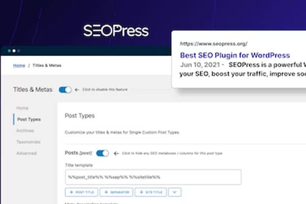
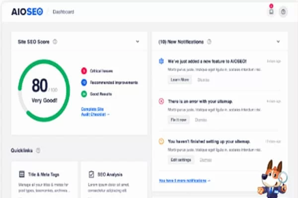
There are a few key things you can do to make sure your WordPress site is optimised for search engines. One of the most important is to install a plugin that will help you with your SEO (search engine optimisation).
These SEO WordPress plugins help simplify the process if you have limited SEO knowledge. They will provide the tools and outline to follow to better your pages and posts to start getting results with the your content that you have created on your website.
Here are a few recommended WordPress SEO plugins to check out and to choose one to install on your WordPress website.
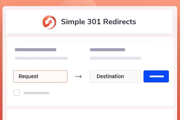
Once you have established a page/post that requires a redirection you can do this easily through a WordPress plugin without needing to know any complex coding. There are many WordPress redirect plugins available, each with its own unique features.

To continuously improve your website you should test your website often and have someone overlook the site and provide feedback. By doing this, you can be sure that your website is effective and engaging for your audience. Additionally, it will help you identify any potential problems that could impact your website’s success. Test your website regularly to ensure its continued success.
When testing your website, there are a few key things to keep in mind. First, you’ll want to make sure that all of the content on your site is accurate and up-to-date. This includes checking for typos, broken links, and outdated information. Secondly, you’ll want to test the functionality of your site to ensure that everything is working properly. This includes testing forms, buttons, and other interactive elements.
Finally, you’ll want to evaluate the overall design of your site to make sure that you’re effectively capturing your visitor’s attention and providing a good user experience. This includes considering things like the layout, colours, and overall aesthetics of your site.
Ensuring that your website is regularly tested and up-to-date is critical to its success. By taking the time to do this, you can rest assured knowing that your site is in good shape and will continue to be successful in the future.
Google Analytics is like having a Swiss army knife of marketing knowledge at your fingertips. Google Analytics can show you how many people are visiting your website, where they’re coming from, what they’re looking at, and how long they’re staying. It can also help you track conversions, set goals, and measure your return on investment (ROI).
Google Analytics is a powerful tool that every business should be using to get the most out of their website. If you’re not already using Google Analytics, now is the time to start!
Google have this tool free for website owners to access data that Google collects when users interact with their site. This data is then used to produce marketing insights that can help businesses make more informed decisions about how to reach and engage their audiences.
There are many different ways to use Google Analytics, but some of the most common use cases include:
Google Analytics is a free service offered by Google that generates detailed statistics about the visitors to a website.
Heatmaps can be used on your WordPress website to track your user movements on your website. For a marketer, this information is critical to understanding how users interact with your site and what areas need improvement.
There are a few different options for heatmap software, but Hotjar, Clarity, and Crazy Egg are three of the most popular. These programs give you the ability to see where users are clicking, scrolling, and hovering on your website.
These heatmap programs take a snapshot of your pages and follow the mouse pointer activity of your visitors. The map will show the most clicked places your visitors use on your page and can quickly identify problem areas on your website.
Hotjar is a great option if you want to track user behavior on your website in real-time. Clarity is another popular choice that offers more detailed analysis of user behavior. Crazy Egg is a good option if you want to track how users interact with your site over time.
No matter which heatmap program you choose, you’ll be able to get valuable insights into how your users interact with your website. This information can help you make better decisions about where to place content, buttons, and links on your pages.
So there you have it, eight essential principles of good web design that will help increase conversions. Keep these in mind when designing your website, and you’ll be sure to see a difference in your results. Thanks for reading! If you need help with implementing these tips get in touch with us today.
Loved this article? Please consider sharing it with your friends…

Peter Lowen
Senior Web Developer | CEO
Peter Lowen is the founder and CEO of Constructive Visual, a website design and hosting company. He has been creating websites since 2005 and writes content on business, marketing, web design, sales training, web hosting and WordPress related topics.
Responsive Web Design – Best Practices for a Responsive Website
In an era where digital presence is imperative, having a responsive website is no longer optional—it’s essential. At Constructive Visual,...
Strengthen your Perth & Wheatbelt business’s online presence with tailored website design and hosting, raising visibility, enhancing user experience, and...
Branding is essential for any business, big or small. It helps to create a unique identity and sets you apart...
Creating a Strong Online Foundation – Small Business Web Design in Perth
In today’s digital age, having a well-designed website is crucial for small businesses in Perth. A professionally designed website can...

We are an SEO & web design agency located in Northam, Western Australia.
Address: PO Box 985,
Northam WA 6401
Location: Perth, Western Australia
Phone: (08) 6118 9186
Email: Contact Us
Services
Information